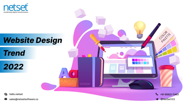
Every year website and app designs get rejuvenated and redesigned with modern techniques and hot elements embedded into the previous custom patterns. With a tint of freshness, simplicity, and definition, the design elements can be mixed and matched to reach the heights of realism.
Breathing life into the digital world, website designing has been leveraged and leveled high to render exceptionally-engaging and communication-oriented websites powered by digital product development.
And it is to no surprise that,
“Designs Speak Louder than Words and play a Significant Role in Business Conversions!”
Out of the 2020 website designs, many are extensions of the previously predicted patterns but also include some unique ones that help you create mind-boggling websites that are worth exploring for modern users.
Best Website Design Trends bringing Heavy Conversions & Superior User Experience
#Congenia Colors
Scrutinizing the digital nature of the job market today, coloring a website with just the right elements of cheerfulness and hope can derive an uncommon user experience. Web designers today put a sheer focus on color schemes and target the ones being easier on the eyes.
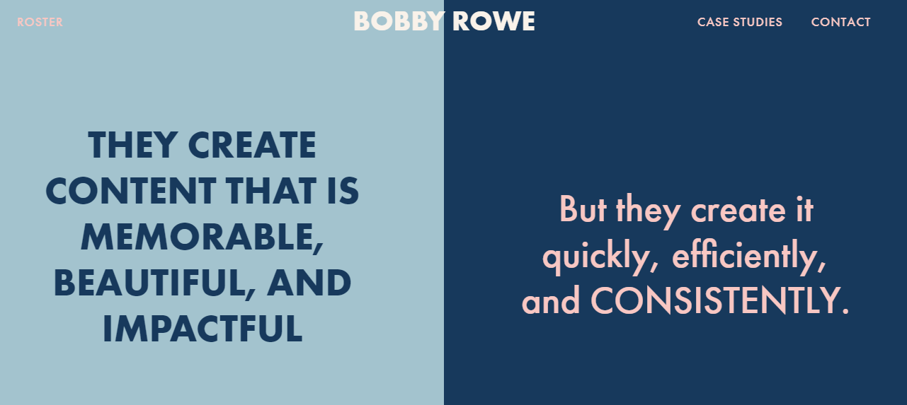
In 2021, they will focus on bringing something outside the extremes of light and dark will ground to soft and muted colors that will tend to relate to a more natural feel. Not all website visitors are fond of dramatic innovations and connect more with faint and subdued backgrounds, making the design feel much alive and talking.
The below image is a combination of subtle distortion of light and dark that is well rounded in its web design ambiance, more concerned with accessibility and comfort.
#Scrolling Transformations
While scrolling a website, a user is doing more than navigating the website.
He’s interacting!
Scrolling transformations is a way to develop a focused interaction with the user, allowing him to participate or involve in the things happening on the website. It’s one of the subtle and indirect forms of communicating with the user where sometimes each scroll can feel like a new website page.
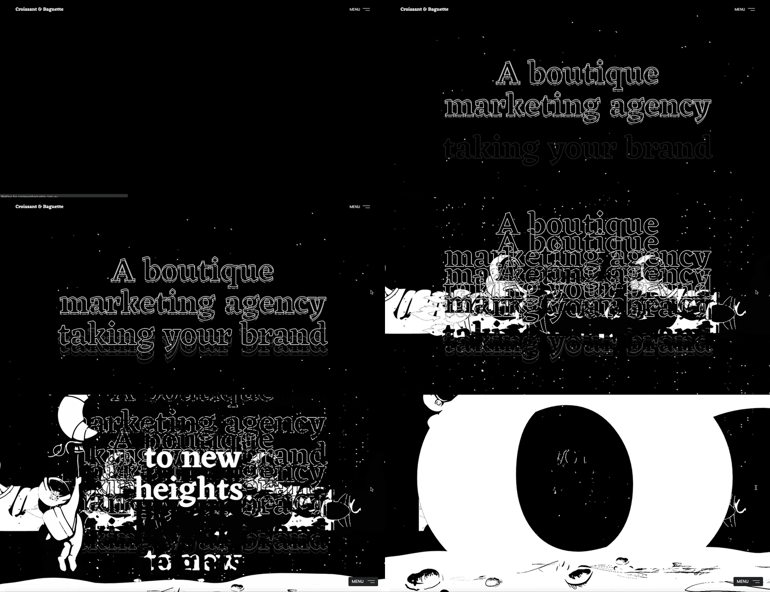
Horizontal or vertical, both types of scrolling patterns can be put to best use along with where they can serve as a practical way to disclose secondary information progressively, say an image gallery, a new update, etc.
[Prefer Reading: “UI-UX Design Duo: The Necessary Integrand of a Successful Digital Product.”]
#Dark Mode
The dark mode is everywhere and with its increasing popularity, it’s been made available both in browsers and mobile devices where one can toggle between light and dark modes within a fraction of time.
Being the latest web design of 2020, dark design mode will last for long as it offers high visibility and contrast using soothing colors and provides an optimum user experience without much eye strain.
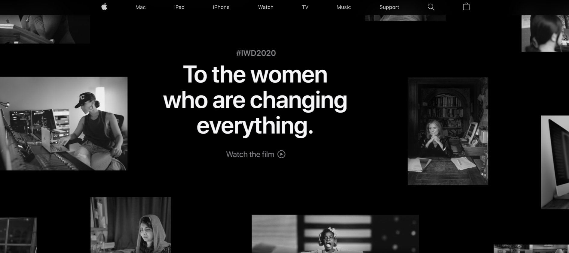
Dark color impacts the overall vibe of the website message and content, so designers must experiment carefully with the color palettes that create an engaging visual feel and do justice with readability and functionality.
#Parrallax Design
Parallax designs were very commonly witnessed in classic video games but recently became a fashion in the web design world. This cool trend is now seen as a part of the scrolling feature of a webpage that comes across as equal parts real and surreal.
The complex programming into the foreground and background extremes, separating the page elements perfectly render a parallax effect, that is gaining high traction in web-based animation.
Its major differential is its depth of transforming a screen into something more analogous and relative to a theater stage. The technique used stimulates 3D depth by moving the background slower than the layers in the foreground which can be compared with a real-life scenario of viewing passing scenery while driving.
#Black & White Illustrations (Colorless UI)
It’s true that minimal plain design can still be an engaging experience. Adding a tint of dynamic effects, animations, and micro-interactions black and white theme illustrations are still famous and a preferred choice of many.
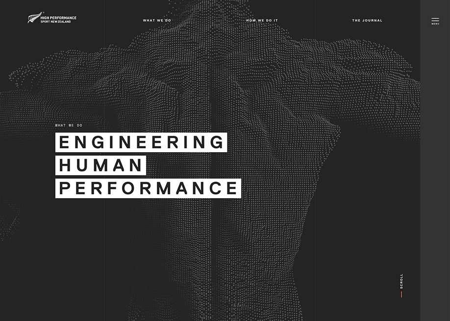
These simply include flat drawings (with or without animations) or big bold content letters that puts a heavy impact on the user with their whimsy playful nature. Colorless website designs seem more real, influential, and in-the-moment and are known to glue visitor’s attention on the website, holistically.
These illustrations seem to “match” almost any design aesthetic as well, making them a popular option for all kinds of industries or website types.
[Prefer Reading: “Can Design-Development Phases be Leveled with Prototypes?”]
#Big Bold Typography
To make the written language legible, readable, and appealing, big bold typography took over and eliminated the need of adding images or graphics.
It’s rightly said and seen, the bigger the letters, the heavier the impression. When you have fewer words that aim to speak everything, this trend works the best irrespective of choosing any thick or thin font style.
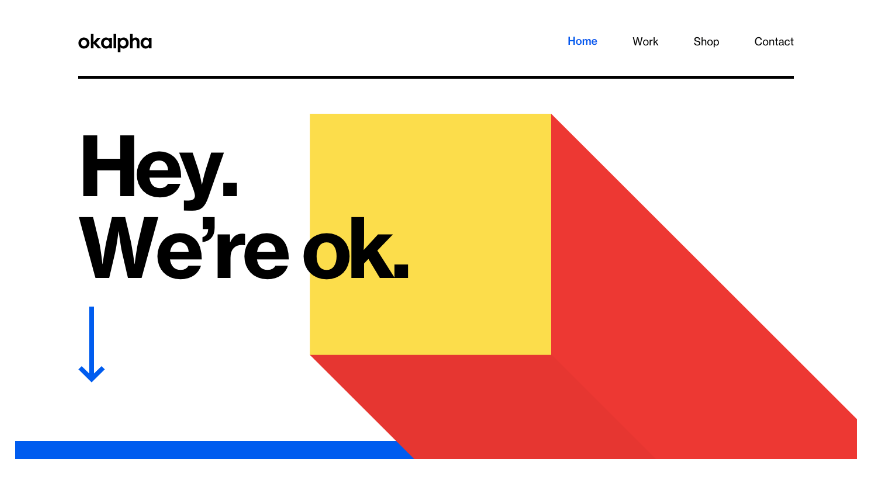
The bigger size of the font seeks all the heed and can be blended with busy backgrounds, fancy images, or flat interfaces for your content/text to stand out. This website design can be well-matched with the gaussian blur pattern that adds further enhancement to it.
Pro Tips:
- Keep a trendy typeface
- Choose a simple background, and
- Manage text corresponding to vertical/horizontal spaces
Just commit these three to the memory and you’re good to go!
#Gaussian Blur
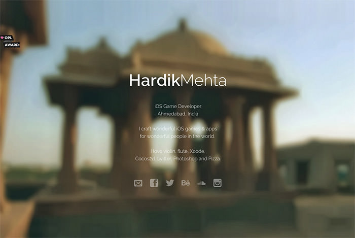
This trend helps you focus on images and gradients and is used in more prominent spaces in web designs. A pleasing gaussian blur of color is a subtle design option that is known to perfectly capture the eye lens.
“Simple can be Extraordinary!”
Colors can be mixed and matched or simply used for creative and cohesive web designs with gaussian blur in the background. Nor did they make web designs refined and refreshing, but also mobile applications and other sorts of interfaces and artworks.
#3D Representations
The three-dimensional illustrations are known to bring reality and virtual reality together that has given web designers a wide spectrum to play with almost everything using 3D. Adding color transitions, this trend can be just the right option to seek in the creative process.
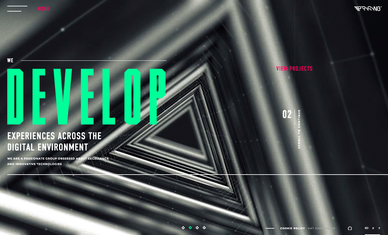
With a delightful and more captivating appearance, 3D elements are inexpensive to implement where designers and companies embrace this evergreen web design to create triumphs that are admired by users.
Adding to the overall user experience, three-dimensional representations can go with the flow with minimalist layouts, making a huge impact.
#Abstract Art Compositions
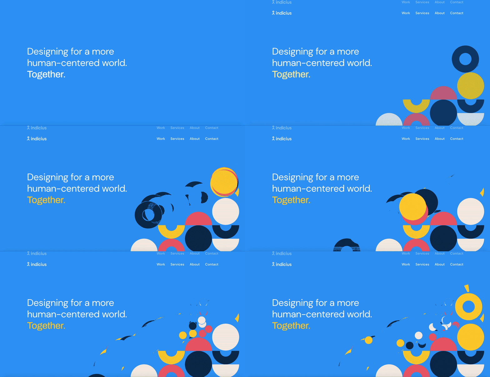
Shapes including geometric primitives (squares, lines, circles…) are seen as minimalist and sophisticated design patterns that can be restrictive or be used to exude freedom. In 2021, photography would take a backseat and would be surpassed by abstract art elements, however, can still be peered with images and figure illustrations.
Websites possessing abstract art designs can compose to be more impressive, expressive, and alive, even in the absence of familiar human faces.
Let’s Light Up Your Web Design!
The above-mentioned designs, whether they are extensions of the previous year or are the latest in the field, will be all at their best performance when designed and combined with a thoughtful and intentional scheme.
Dedicated website designers at NetSet can leverage these design trends and make them highly usable, layer-able, and playful for your next website development project. They can help you optimize your website with synthesized designs and patterns that will deliver highly-engaging web design results.
